Emira Styling: We all know it's gorgeous, but why...?

eclat2emira

Emira Maniac
Joined
Jul 19, 2021
Messages
1,236
Reaction score
2,395
Location
Edinburgh
Trying to deconstruct the Emira design and understand why it appeals to us all so much is not easy. Has anyone noticed that no-one is raving about any single aspect as the main highlight or reason it looks so good? "It's the intakes" "It's the rear deck" It's the profile..." Nope.

In my view this is because it is the whole design that works - it is one of the most cohesive designs I've ever seen. Everything relates to everything else, everything has a reason to be there and a role to play, whether is to contribute flow, balance, reduce visual mass or create a sense of movement and dynamism. I've prepared some marked up photos and notes below, using the Ferrari 488 as a comparison - one someone else correctly highlighted as similar and relevant, albeit it is larger, a lot more expensive and a less successful design for reasons highlighted below.

Many of the comments about the 488 would apply to other cars such as the Corvette C8 - the reason for the comparison is not to knock other cars, I'm a fan of these too - it's simply to highlight where the Emira styling is more successful and why.

A small note that may be useful (as someone who used to mis-use the term design when actually referring to styling) I think it was Gordon Murray who explained it something like this:
"Design" technically applies to the entire layout, engineering, packaging and construction of a car.
"Styling" is more appropriate for how you choose to "clothe" the whole, once you have a lot of the construction hard points set, such as wheelbase, layout, key dims. The Emira could have looked very different indeed with different styling, even with the same design of chassis, engine, wheelbase, etc.

On that note....
Emira side sketch 02.jpg

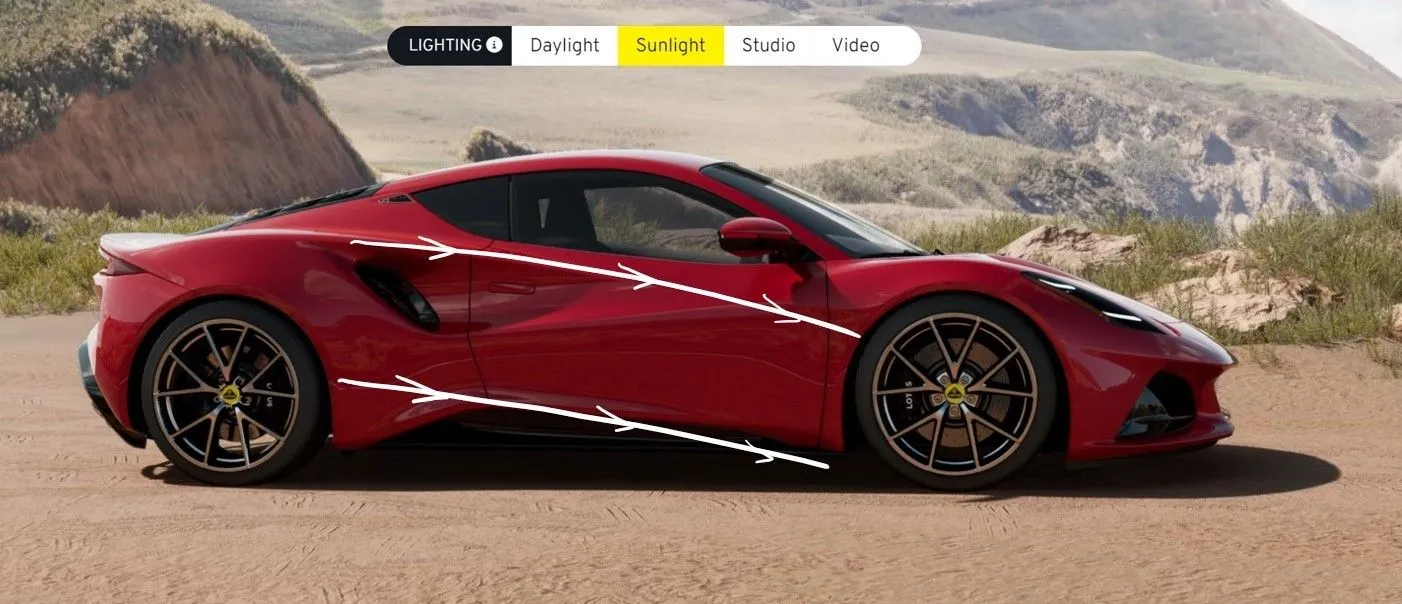
These forward rake of these 2 lines gives "go-ahead" - the reason the Emira looks like it is moving even when it is standing still.
Emira side sketch 01.jpg

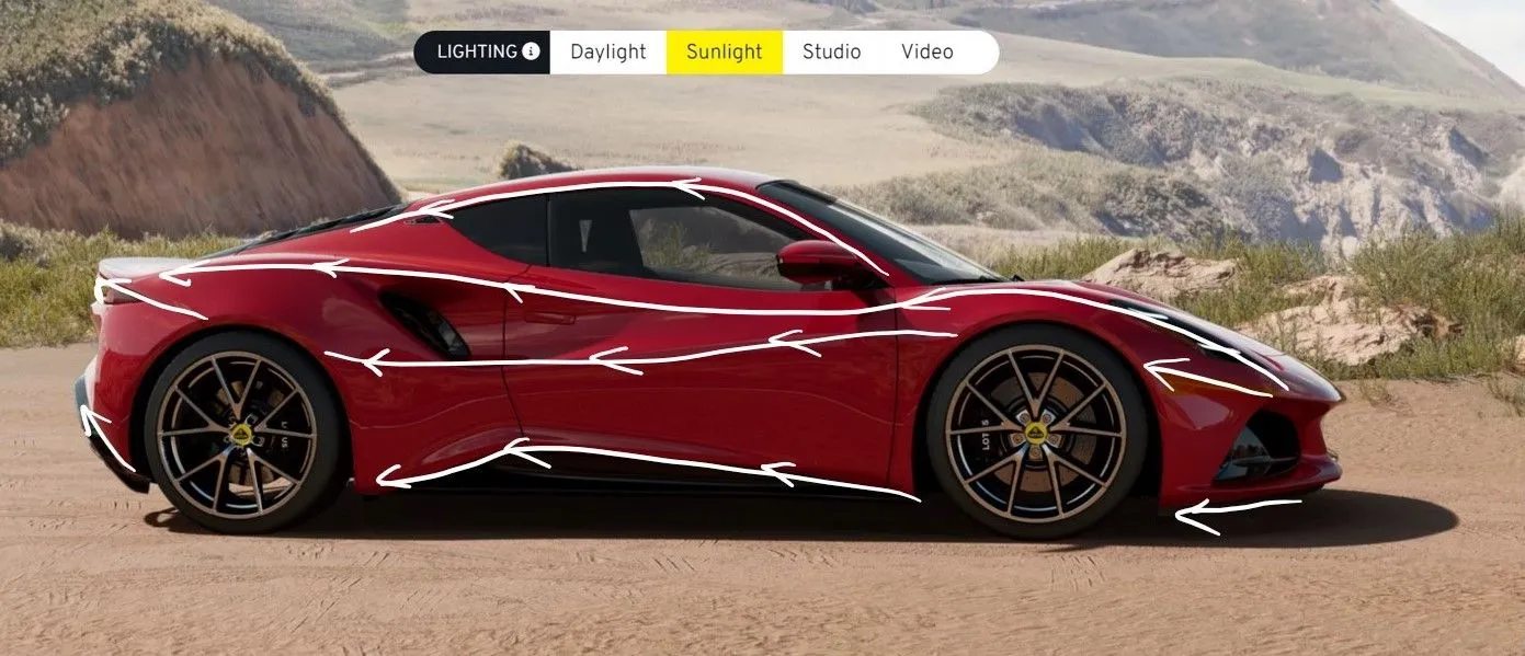
Here you can see how well the lines flow from front to rear, none of them straight or horizontal - giving the Emira an organic form and one of the reasons it is so easy on the eye. Think of it like a flowing river, with no boulders blocking the flow or creating turbulence.
Emira side sketch 03.jpg

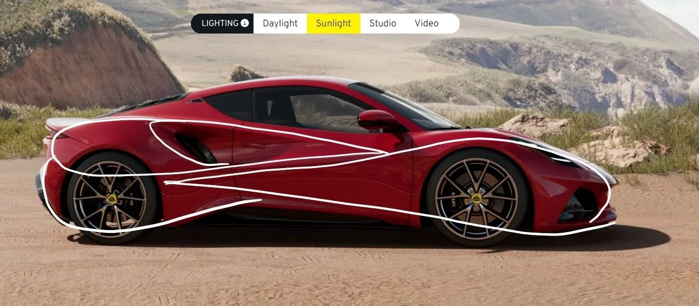
Here I've outlined some of the forms and volumes, which all share a common form and repeat beside and within each other. Some of them come and go with the light direction and different angles as the subtle body creases fade out. Some are colour-sensitive in terms of which are dominant - but it is all harmonious.
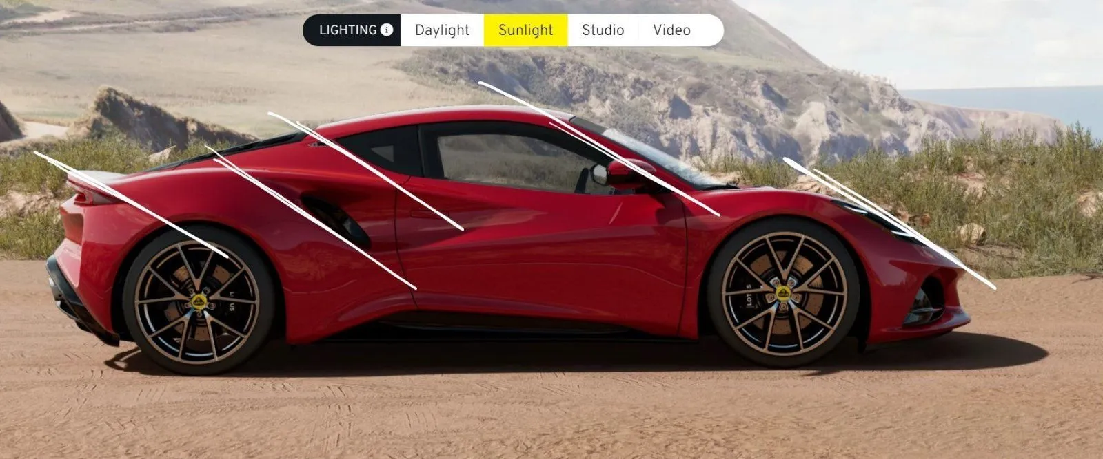
Emira side sketch 04.jpg

The image above highlights harmony and go-ahead. The lines all sharing common angles is no accident and again lends cohesion and a sense of movement.
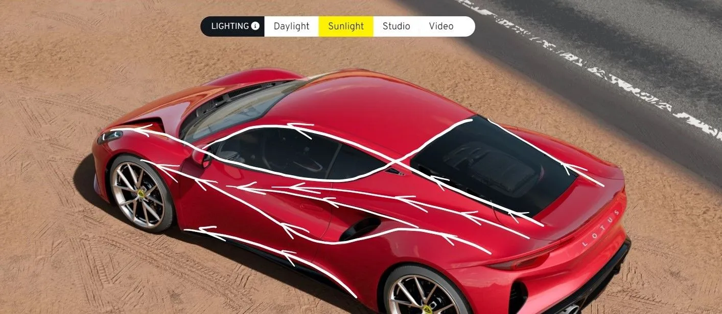
Emira side three-quarter 01.jpg

One of my favourite views, for me this perfectly captures the fluidity of the design. The volume of the rear haunches is commonly used, as it is very successfully used here, to suggest power similar to many 4-legged predators. The way this volume blends into the rest of the form, while also creating some wonderful lines is simply masterful.

The one area of visual tension is where the upper rearmost aspect of the side window profile meets the roof-line and here one of the most successful parts of the Evora styling has been recycled, allowing this line to continue rather than come to a juddering halt by blending it with the top of the rear screen. This creates a perfect focal point and location for the badge.


Onto the 488 now, please bear in mind I am a Ferrari fan, just not a fan of some recent styling; the gorgeous Roma is a welcome return to beauty and fluidity over aggression and brutality.
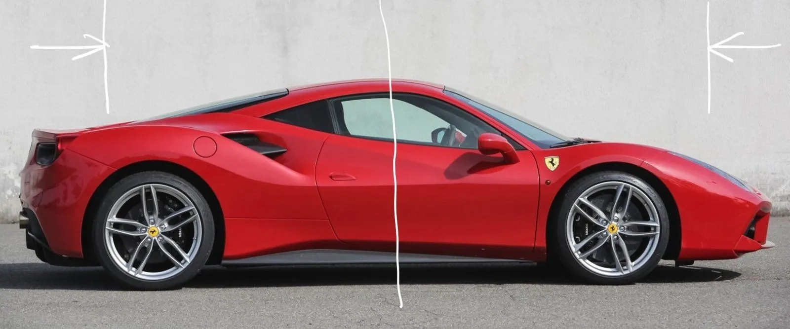
488 side 03.jpg

This first one is quite simple but took me a while to cotton on to - but I knew something wasn't sitting right. There is a real point of symmetry here which is robbing the 488 of a cab forward or rearward look. Ask any artist and they'll say something sitting in the centre rarely works.

If you look at the image below and in turn cover the front 1/6th and rear 1/6th with your hand (where I've added lines) you'll see it immediately looks better as the proportions change and it becomes cab forward or cab rearward.

488 side 03.jpg

Below are two aspects that baffle me. The overall shape of the 488 is pretty damn nice and quite organic - but then you have some mismatching angles and very blocky, linear shapes which just seem to fight with the shape rather than work with it.

The horizontal lines (door crease and rear arch panel join) kill the flow. Nothing leads the eye anywhere to help the flow - everything is literally going off at tangents. You can say it's dramatic but I don't find it remotely beautiful.

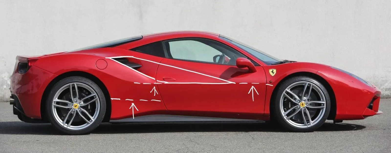
488 side 01.jpg
488 side 02.jpg


A game changer for me is a black roof on the 488 - this allows the shape of the main body volume to flow, and gives a rear-heavy emphasis which works. Look at how the green line flows - that is classic Ferrari. The orange line shows where the unfortunate horizontal crease starts to weaken the appeal.
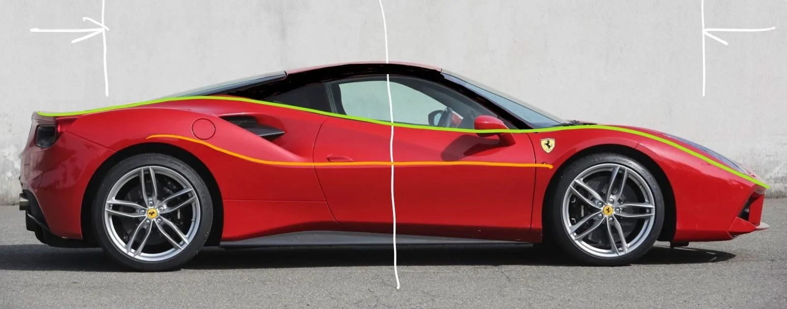
488 side 06.jpg


Had this crease had a more organic flow and upward kick (see below) like the Emira then the whole 488 shape starts to work for me.

I've just realised it will only let me add 10 images - I can add the remaining two or three if that's of interest...

I'm not a car designer or stylist but I am an artist and understand flow, form and cohesion. You may agree or strongly disagree with any or all of this but if it has got you looking at the Emira with a shade more insight as to why you love it then this has been worthwhile.


.
 
Last edited:
Trying to deconstruct the Emira design and understand why it appeals to us all so much is not easy. Has anyone noticed that no-one is raving about any single aspect as the main highlight or reason it looks so good? "It's the intakes" "It's the rear deck" It's the profile..." Nope.

In my view this is because it is the whole design that works - it is one of the most cohesive designs I've ever seen. Everything relates to everything else, everything has a reason to be there and a role to play, whether is to contribute flow, balance, reduce visual mass or create a sense of movement and dynamism. I've prepared some marked up photos and notes below, using the Ferrari 488 as a comparison - one someone else correctly highlighted as similar and relevant, albeit it is larger, a lot more expensive and a less successful design for reasons highlighted below.

Many of the comments about the 488 would apply to other cars such as the Corvette C8 - the reason for the comparison is not to knock other cars, I'm a fan of these too - it's simply to highlight where the Emira styling is more successful and why.

A small note that may be useful (as someone who used to mis-use the term design when actually referring to styling) I think it was Gordon Murray who explained it something like this:
"Design" technically applies to the entire layout, engineering, packaging and construction of a car.
"Styling" is more appropriate for how you choose the "clothe" the whole, once you have a lot of the construction hard points set, such as wheelbase, layout, key dims. The Emira could have looked very different indeed with different styling, even with the same design of chassis, engine, wheelbase, etc.

On that note....

View attachment 3003
These forward rake of these 2 lines gives "go-ahead" - the reason the Emira looks like it is moving even when it is standing still.
View attachment 3004
Here you can see how well the lines flow from front to rear, none of them straight or horizontal - giving the Emira an organic form and one of the reasons it is so easy on the eye. Think of it like a flowing river, with no boulders blocking the flow or creating turbulence.
View attachment 3005
Here I've outlined some of the forms and volumes, which all share a common form and repeat beside and within each other. Some of them come and go with the light direction and different angles as the subtle body creases lines fade out. Some are colour sensitive in terms of which are dominant - but it is all harmonious.

View attachment 3006
This highlights harmony and go-ahead. The lines all sharing common angles is no accident and again lends cohesion and a sense of movement.
View attachment 3007
One of my favourite views, for me this perfectly captures the fluidity of the design. The volume of the rear haunches is commonly used, as it is very successfully used here, to suggest power similar to many 4-legged predators. The way this volume blends into the rest of the form, while also creating some wonderful lines is simply masterful.

The one area of visual tension is where the upper rearmost aspect of the side window profile meets the roof-line and here one of the most successful parts of the Evora styling has been recycled, allowing this line to continue rather than come to a juddering halt by blending it with the top of the rear screen. This creates a perfect focal point and location for the badge.


Onto the 488 now, please bear in mind I am a Ferrari fan, just not a fan of some recent styling; the gorgeous Roma is a welcome return to beauty and fluidity over aggression and brutality.

View attachment 3008
This first one is quite simple but took me a while to cotton on to - but I knew something wasn't sitting right. There is a real point of symmetry here which is robbing the 488 of a cab forward or rearward look. Ask any artist and they'll say something sitting in the centre rarely works.

If you look at the image below and in turn cover the front 1/6th and rear 1/6th with your hand (where I've added lines) you'll see it immediately looks better as the proportions change and it becomes cab forward or cab rearward.

View attachment 3009
Below are two aspects that baffle me. The overall shape of the 488 is pretty damn nice and quite organic - but then you have some mismatching angles and very blocky, linear shapes which just seem to fight with the shape rather than work with it.

The horizontal lines (door crease and rear arch panel join) kill the flow. Nothing leads the eye anywhere to help the flow - everything is literally going off at tangents. You can say it's dramatic but I don't find it remotely beautiful.

View attachment 3010View attachment 3011

A game changer for me is a black roof on the 488 - this allows the shape of the main body volume to flow, and gives a rear-heavy emphasis which works. Look at how the green line flows - that is classic Ferrari. The orange line shows where the unfortunate horizontal crease starts to weaken the appeal.

View attachment 3012

Had this crease had a more organic flow and upward kick (see below) like the Emira then the whole 488 shape starts to work for me.

I've just realised it will only let me add 10 images - I can add the remaining two or three if that's of interest...

I'm not a car designer or stylist but I am an artist and understand flow, form and cohesion. You may agree or strongly disagree with any or all of this but if it has got you looking at the Emira with a shade more insight as to why you love it then this has been worthwhile.


.
Interesting idea for a message thread as we while the wait time away.
My reply, in a word: Dynamic.
For those looking for more words: the design intrinsically follows the dictum Form follows Function. The Emira looks like something begging to be driven and promises a unique driving experience because of the stance and aero systems. It will take you places, both in your mind and roadways.
As life unwinds, enjoy it in a Lotus.
 
  • Thread Starter
  • Thread starter
  • #3
Interesting idea for a message thread as we while the wait time away.
My reply, in a word: Dynamic.
For those looking for more words: the design intrinsically follows the dictum Form follows Function. The Emira looks like something begging to be driven and promises a unique driving experience because of the stance and aero systems. It will take you places, both in your mind and roadways.
As life unwinds, enjoy it in a Lotus.
Nicely put! Dynamic would certainly be one of my top 3 words to describe the Emira.
 
Trying to deconstruct the Emira design and understand why it appeals to us all so much is not easy. Has anyone noticed that no-one is raving about any single aspect as the main highlight or reason it looks so good? "It's the intakes" "It's the rear deck" It's the profile..." Nope.

In my view this is because it is the whole design that works - it is one of the most cohesive designs I've ever seen. Everything relates to everything else, everything has a reason to be there and a role to play, whether is to contribute flow, balance, reduce visual mass or create a sense of movement and dynamism. I've prepared some marked up photos and notes below, using the Ferrari 488 as a comparison - one someone else correctly highlighted as similar and relevant, albeit it is larger, a lot more expensive and a less successful design for reasons highlighted below.

Many of the comments about the 488 would apply to other cars such as the Corvette C8 - the reason for the comparison is not to knock other cars, I'm a fan of these too - it's simply to highlight where the Emira styling is more successful and why.

A small note that may be useful (as someone who used to mis-use the term design when actually referring to styling) I think it was Gordon Murray who explained it something like this:
"Design" technically applies to the entire layout, engineering, packaging and construction of a car.
"Styling" is more appropriate for how you choose to "clothe" the whole, once you have a lot of the construction hard points set, such as wheelbase, layout, key dims. The Emira could have looked very different indeed with different styling, even with the same design of chassis, engine, wheelbase, etc.

On that note....

View attachment 3003
These forward rake of these 2 lines gives "go-ahead" - the reason the Emira looks like it is moving even when it is standing still.
View attachment 3004
Here you can see how well the lines flow from front to rear, none of them straight or horizontal - giving the Emira an organic form and one of the reasons it is so easy on the eye. Think of it like a flowing river, with no boulders blocking the flow or creating turbulence.
View attachment 3005
Here I've outlined some of the forms and volumes, which all share a common form and repeat beside and within each other. Some of them come and go with the light direction and different angles as the subtle body creases fade out. Some are colour-sensitive in terms of which are dominant - but it is all harmonious.

View attachment 3006
The image above highlights harmony and go-ahead. The lines all sharing common angles is no accident and again lends cohesion and a sense of movement.
View attachment 3007
One of my favourite views, for me this perfectly captures the fluidity of the design. The volume of the rear haunches is commonly used, as it is very successfully used here, to suggest power similar to many 4-legged predators. The way this volume blends into the rest of the form, while also creating some wonderful lines is simply masterful.

The one area of visual tension is where the upper rearmost aspect of the side window profile meets the roof-line and here one of the most successful parts of the Evora styling has been recycled, allowing this line to continue rather than come to a juddering halt by blending it with the top of the rear screen. This creates a perfect focal point and location for the badge.


Onto the 488 now, please bear in mind I am a Ferrari fan, just not a fan of some recent styling; the gorgeous Roma is a welcome return to beauty and fluidity over aggression and brutality.

View attachment 3008
This first one is quite simple but took me a while to cotton on to - but I knew something wasn't sitting right. There is a real point of symmetry here which is robbing the 488 of a cab forward or rearward look. Ask any artist and they'll say something sitting in the centre rarely works.

If you look at the image below and in turn cover the front 1/6th and rear 1/6th with your hand (where I've added lines) you'll see it immediately looks better as the proportions change and it becomes cab forward or cab rearward.

View attachment 3009
Below are two aspects that baffle me. The overall shape of the 488 is pretty damn nice and quite organic - but then you have some mismatching angles and very blocky, linear shapes which just seem to fight with the shape rather than work with it.

The horizontal lines (door crease and rear arch panel join) kill the flow. Nothing leads the eye anywhere to help the flow - everything is literally going off at tangents. You can say it's dramatic but I don't find it remotely beautiful.

View attachment 3010View attachment 3011

A game changer for me is a black roof on the 488 - this allows the shape of the main body volume to flow, and gives a rear-heavy emphasis which works. Look at how the green line flows - that is classic Ferrari. The orange line shows where the unfortunate horizontal crease starts to weaken the appeal.

View attachment 3012

Had this crease had a more organic flow and upward kick (see below) like the Emira then the whole 488 shape starts to work for me.

I've just realised it will only let me add 10 images - I can add the remaining two or three if that's of interest...

I'm not a car designer or stylist but I am an artist and understand flow, form and cohesion. You may agree or strongly disagree with any or all of this but if it has got you looking at the Emira with a shade more insight as to why you love it then this has been worthwhile.
.

All those gorgeous lines, yet the FE badge is still crooked. 😂

242875360_10158790961484864_123650676485182545_n.jpg
 
I think this matches a lot of what I muttered to myself at the in-person viewing... well worded, and well done.

I'm also tempted to get that second set of flow lines made up as vinyl stickers... who's with me!? *crickets* :)
 
  • Thread Starter
  • Thread starter
  • #7
All those gorgeous lines, yet the FE badge is still crooked. 😂

View attachment 3013
I am with you - but also not! This is a bit of a Hobson's choice as it will not line up with everything, so may always look "off".

It has been positioned to follow the side glazing line, not where the body panel overlaps the engine cover vents - see yellow line on the below:
emira badge.jpg

Thankfully on darker colours - like my verdant green, this will be less apparent!
 
  • Thread Starter
  • Thread starter
  • #8
I think this matches a lot of what I muttered to myself at the in-person viewing... well worded, and well done.

I'm also tempted to get that second set of flow lines made up as vinyl stickers... who's with me!? *crickets* :)
Thank you - glad it struck a chord! Fluorescent yellow flow lines would be a bit like they use when testing F1 aero - funky as hell!
 
I am with you - but also not! This is a bit of a Hobson's choice as it will not line up with everything, so may always look "off".

It has been positioned to follow the side glazing line, not where the body panel overlaps the engine cover vents - see yellow line on the below:
View attachment 3017
Thankfully on darker colours - like my verdant green, this will be less apparent!

Agreed, but shouldn't the recessed part align properly with the emblem? It looks like it's melting out of its proper position.
 
Great analysis and clearly explained. I've previously described it as like a cheetah tensed ready to run. Dynamic and Purposeful are great words for it.

What fascinates me is the very deliberate way the Lotus team have combined both engineering/design and styling. So all the curves and vents you see aren't just part of the styling (ie for visual effect), they all serve a function. Almost all of them serve a specific aero purpose. As well as looking excellent, the Emira is very unusual in having aero balance (fore/aft and left/right) that doesn't change position as speed varies - this will make for a very stable and confidence-inspiring high-speed drive.
 
  • Thread Starter
  • Thread starter
  • #11
Great analysis and clearly explained. I've previously described it as like a cheetah tensed ready to run. Dynamic and Purposeful are great words for it.

What fascinates me is the very deliberate way the Lotus team have combined both engineering/design and styling. So all the curves and vents you see aren't just part of the styling (ie for visual effect), they all serve a function. Almost all of them serve a specific aero purpose. As well as looking excellent, the Emira is very unusual in having aero balance (fore/aft and left/right) that doesn't change position as speed varies - this will make for a very stable and confidence-inspiring high-speed drive.
Thanks Tom, and you've highlighted another aspect of the Emira's design that make it such a winner. As you said, everything here is functional - rarely have form and function been so holistically considered and reconciled so well. It really is one of those lightning in a bottle moments.

I think Gordon Murray and Peter Stevens achieved something similar with the Mclaren F1 design and styling, no others that come to mind have blended form and function as well.
 
  • Thread Starter
  • Thread starter
  • #12
Agreed, but shouldn't the recessed part align properly with the emblem? It looks like it's melting out of its proper position.
I get what you mean, if the upper edge of the recess moved to an angle midway between its current position and the top edge of the emblem that might sweeten it up a bit - but that ain't gonna happen! 🤣

Like you, I enjoy exploring these little details though.
 
  • Thread Starter
  • Thread starter
  • #14
Amazing post @eclat2emira and very instructive.

Now, wouldn't it be nice if we could see all this design/style while we are driving it?

Guess we'll have to pit-stop more than usual.

#ForTheViewers
Thank you, glad you got something out of it. There is always that sad irony that everyone else gets to enjoy the exterior while you are driving it, I'm hoping the inside will feel special enough to offset that.

But frequent pit-stops a great idea!
 
@eclat2emira, what do you think of the bonnet cutouts? Those (and the headlights) are the two parts I struggle with… I like how they exaggerate the bulge above the wheel, but I miss the continuity of colour (as per the 308). I understand how they contribute to passive aero, but still…
 
Very cool post @eclat2emira. Way back in the day I used to fancy myself an amateur car designer and would spend hours drawing wild looking sports cars for fun. I knew what I liked, but reading your analysis, I now understand a bit more why. I was always fascinated by the stark contrast of the radical Bertone-designed Lamborghinis vs. the more fluid and athletic Pininfarina Ferraris. Both captivating in their own right, but for very different reasons.

There's no doubt the Emira is a work of art and, like most great art, if has inspired a rather passionate fan base (as evidenced by the intensity of this forum). Every photo and render I see gets me excited. I'm sure seeing the real thing in the flesh will be amazing. Counting the days...
 
I am with you - but also not! This is a bit of a Hobson's choice as it will not line up with everything, so may always look "off".

It has been positioned to follow the side glazing line, not where the body panel overlaps the engine cover vents - see yellow line on the below:
View attachment 3017
Thankfully on darker colours - like my verdant green, this will be less apparent!
So…. If one were to get a base edition, will there be another badge? Or a missing badge?
 
My take on the style is this. When you look at the car your eyes aren't drawn to any one thing. You just keep flowing over the car. When a car has a "strong feature" your eyes tend to rest on that. Like the back of a C8.
 

Create an account or login to comment

Join now to leave a comment enjoy browsing the site ad-free!

Create account

Create an account on our community. It's easy!

Log in

Already have an account? Log in here.

Back
Top