-
Featured
- #21
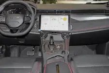
I should probably have kept quiet, but yes, it left me completely cold. I was quite upset - I had an early deposit down and really wanted to love this car.
Maybe it's just me, but a McLaren interior looks and feels so much more 'designed' and driver-focused:
View attachment 1277
I don't want to be over-negative or anything - and I realise that I'm in the minority in finding a whopping great iPad stuck on the car a turn-off - so I'll chip out at this point!
More designed doesn't mean better designed. Frankly, I find the McLaren interior posted here to be overwrought like they are trying too hard with scallops, cutouts, bevels, tiers, that go every different direction with no coherent lines or purpose. Look at the two speaker grills on door. Despite them being expensive compound-shaped metal panels, they look incoherent and lack any sense of beauty or elegance.
If your main complaint with the Emira is the display location, keep in mind that the Emira still offers a manual so the shifter location eliminates the ability to add a large mid-console-located screen as you see in this McLaren. The manual shifter will block the screen in this location. Their only option is to mount the screen higher up, which demands a landscape orientation. The screen has to be brought closer to be within reach, and given the dash slopes away as it goes up...
Form is important, but form often has to follow function, and functional form is usually preferable to form that is there for the sake of form only, and this is especially true for automotive design.
