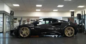
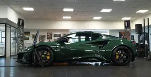
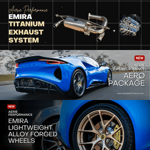
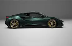
Alternate configurator renders of the other 4 FE colors

    Featured
  • Thread Starter
  • Thread starter
  • #221
Eagle 7 these are fantastic. These are great in studio light. I hope you don’t mind I used some of your renders over on a Facebook forum. Don’t know how to credit you on there? You’ve done some of (almost) my spec in the outside light: green, black wheels, yellow calipers, black alcantara, I wonder if you could do that in this light? On another note it freaked me out a bit to see you had done the exact same thing as me as a graphic. One of the first things I did was put “lotus” on the side sills in yellow. See image…
Thank you! No I don't mind at all. You can just use my forum name and refer to this forum as the origin, since that's where they're coming from.

Here's your request, and I put the LOTUS letters (GMTA!) on the lower rocker sill (in Hethel Yellow) for you.
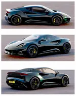
Ubergreg 1.png

Ubergreg 1a.png

Ubergreg 1c.png

Ubergreg 1b.png
 
  • Thread Starter
  • Thread starter
  • #222
The thing is, because Dark Verdant is so dark, detail can easily get lost if there's too much black or dark colors on it. I had actually originally specced mine like this, but without the LOTUS on the rocker sill. It just looked a bit too plain to me, so that's when I added the LOTUS lettering which helped add some sportiness to it. After playing around with it some more, trying to come up with theme ideas, I added a wheel stripe around the wheels so they would have some definition. Lastly, I added a stripe along the edge of the rocker sill. This was the most dramatic as far as a street performance look, without being too much. Everything else I've tried I haven't liked. This car shape is so beautiful, it doesn't need much, or it starts to look hokey and distract from the looks of the car.

Ubergreg 1d.png

Ubergreg 1e.png
 
The thing is, because Dark Verdant is so dark, detail can easily get lost if there's too much black or dark colors on it. I had actually originally specced mine like this, but without the LOTUS on the rocker sill. It just looked a bit too plain to me, so that's when I added the LOTUS lettering which helped add some sportiness to it. After playing around with it some more, trying to come up with theme ideas, I added a wheel stripe around the wheels so they would have some definition. Lastly, I added a stripe along the edge of the rocker sill. This was the most dramatic as far as a street performance look, without being too much. Everything else I've tried I haven't liked. This car shape is so beautiful, it doesn't need much, or it starts to look hokey and distract from the looks of the car.

View attachment 2065
View attachment 2066
I get what you are saying and a LOT of people have said the same. That the dark colour doesn’t show the shape. But I have always loved black cars and they do always work no matter how beautiful the shape or intricate the details. But it’s all about personal taste and that’s as it should be. Interesting to learn that green is the most ordered colour. These are tweaks from your render: it permanently open on my desk top…
 

Attachments

  • A4E6AD08-377C-4BC4-B652-3C9C156D106E.jpeg
    A4E6AD08-377C-4BC4-B652-3C9C156D106E.jpeg
    181.9 KB · Views: 159
  • Thread Starter
  • Thread starter
  • #224
I get what you are saying and a LOT of people have said the same. That the dark colour doesn’t show the shape. But I have always loved black cars and they do always work no matter how beautiful the shape or intricate the details. But it’s all about personal taste and that’s as it should be. Interesting to learn that green is the most ordered colour. These are tweaks from your render: it permanently open on my desk top…
lol wow, it's interesting how far my renders have come from those first ones. I'm constantly working on detail, refining, adding, fixing, etc.
 
Thank you! No I don't mind at all. You can just use my forum name and refer to this forum as the origin, since that's where they're coming from.

Here's your request, and I put the LOTUS letters (GMTA!) on the lower rocker sill (in Hethel Yellow) for you.
View attachment 2061
View attachment 2062
View attachment 2063
View attachment 2064
Thanks for these by the way. Amazing. I am definitely doing the sill graphic le but will match the brake caliper yellow. Also wrapping the wing mirror tops in black (Matt?) and if? The lotus letters on the back are silver with the lower black pack(which I don’t think they should be) I’m also going to get those sprayed black.
 
  • Thread Starter
  • Thread starter
  • #226
After all the time I've spent playing around with ideas, I'm going to just go with a traditional look, except I'll probably get the LOTUS lettering for the side. Once you've seen it, it looks plain without it. This one is in the same yellow as the calipers.

My Spec.png
 
After all the time I've spent playing around with ideas, I'm going to just go with a traditional look, except I'll probably get the LOTUS lettering for the side. Once you've seen it, it looks plain without it. This one is in the same yellow as the calipers.

View attachment 2072
we will be the only two with the same graphics 😂 these are some I did ages ago…
 

Attachments

  • CD48B6EB-6126-439E-A229-70AD9FBE1D5C.jpeg
    CD48B6EB-6126-439E-A229-70AD9FBE1D5C.jpeg
    67.1 KB · Views: 298
  • 6EC908EC-8225-46C6-893F-5ACAC14A79B6.jpeg
    6EC908EC-8225-46C6-893F-5ACAC14A79B6.jpeg
    135.7 KB · Views: 300
  • DA918C8C-C0AC-4F6D-AB08-FC290506D5A2.jpeg
    DA918C8C-C0AC-4F6D-AB08-FC290506D5A2.jpeg
    133.2 KB · Views: 296
we will be the only two with the same graphics 😂 these are some I did ages ago…
Aha! Now I've twigged which Greg you are.

Does someone want to talk to Divine Handcraft about getting those LOTUS graphics added to their shop?
 
After all the time I've spent playing around with ideas, I'm going to just go with a traditional look, except I'll probably get the LOTUS lettering for the side. Once you've seen it, it looks plain without it. This one is in the same yellow as the calipers.

View attachment 2072
It may be traditional, but things become a standard bearer look because they stand the test of time. They are appreciated because of this. There is something primal about it. I think this spec looks magnificent!

I wonder if you have ever tried an italicized non-serif font for the Lotus logo on the sill. I know it doesn’t match the logo on the back, but it implies movement and might look cool. Just a thought.
 
Wait is that green even close to what we expect the car to look like? Seems lighter.
Only got to see the paint discs here in Oz but the green was black with green undertones in direct sunlight. How green are you guys in the UK expecting it to be??
 
  • Thread Starter
  • Thread starter
  • #234
Here's one of the photos of the actual sample disc outside in the sun, which I used to create the paint shader for my 3D model.
Verdant disc.jpeg
My Spec 1a.png

My Spec 1b.png
 
  • Thread Starter
  • Thread starter
  • #235
It may be traditional, but things become a standard bearer look because they stand the test of time. They are appreciated because of this. There is something primal about it. I think this spec looks magnificent!

I wonder if you have ever tried an italicized non-serif font for the Lotus logo on the sill. I know it doesn’t match the logo on the back, but it implies movement and might look cool. Just a thought.
I tried several different things, including the traditional serif font used on the original Lotus logo, but none of them looked right. Though it's a complex shape, the Emira is a clean design, and the more I tried to change it with design or graphic ideas, the more I began to appreciate just how much thought and effort was put into it by Carr and his team. The car has that feel of classic greatness along the lines of something Michelangelo or DaVinci would sculpt. The artistry of the shape and attention to detail is at that level of talent and skill, which is why I wound up doing almost nothing to it. Every car I buy I always at least change the wheels, and then things like intake and exhaust, but this may be the first car where I don't.
 
Here's one of the photos of the actual sample disc outside in the sun, which I used to create the paint shader for my 3D model.
View attachment 2079View attachment 2080
View attachment 2081
When I look at this, in my head it's a little too much of a jewel-tone, if you know what I mean? I feel like in reality it's a little more dark green and less of the bluish tinge and more black. Maybe that's just what I am hoping for?
 
When I look at this, in my head it's a little too much of a jewel-tone, if you know what I mean? I feel like in reality it's a little more dark green and less of the bluish tinge and more black. Maybe that's just what I am hoping for?
So interesting how color evokes different reactions from people. That it has a jewel tone and can read black is actually one of the things I like about it. I’m hoping for similar themes but in Magma red….jewel tone in the sun (ruby) and deep blood red (like a Cabernet) in shade or when overcast.
 
When I look at this, in my head it's a little too much of a jewel-tone, if you know what I mean? I feel like in reality it's a little more dark green and less of the bluish tinge and more black. Maybe that's just what I am hoping for?
Here's one of the photos of the actual sample disc outside in the sun, which I used to create the paint shader for my 3D model.
View attachment 2079View attachment 2080
View attachment 2081
Interesting but I would swear the disk I saw was significantly darker than the one you photographed. The green black ratio was the inverse.
This is all becoming insanity, this is a car that is costing me 115,000GBP or $155,000 USD on the road and I can’t get a decent colour chart or find out about recommended colour combos.
I’m beginning to wonder whether it’s worth the stress, after all it’s just a bloody toy. I don’t need it to prove the size of my appendage.
The other way to look at this is that we are able to even pontificate at this point.
The FE factor is a heavy burden with a great reward.

Otherwise we could have zero information and see them all in the flesh whenever they’d be launched.

I’d prefer this journey over that one. :)
 
lol wow, it's interesting how far my renders have come from those first ones. I'm constantly working on detail, refining, adding, fixing, etc.
Might I suggest you consider a little side business? These renders are really fantastic and would look great on any enthusiast’s wall. On high quality paper I’d be a buyer…..once I actually settle on a spec😆. An alternative, if the the resolution is sufficiently high, would be to ask a nominal fee for a jpeg or tiff file that the owner could use in any way they wish. I might like a coffee mug for example. Just a thought.
 

Create an account or login to comment

Join now to leave a comment enjoy browsing the site ad-free!

Create account

Create an account on our community. It's easy!

Log in

Already have an account? Log in here.

Back
Top