Last edited by a moderator:
Navigation
Install the app
How to install the app on iOS
Follow along with the video below to see how to install our site as a web app on your home screen.
Note: This feature may not be available in some browsers.
More options
Style variation
-
📸 We've added a new feature to the site, the Showcase! You can check it out at this link: EmiraForum.com Showcase
🖼️ You can read a bit more at the announcement thread as well: Showcase -- an upgraded Journal
You are using an out of date browser. It may not display this or other websites correctly.
You should upgrade or use an alternative browser.
You should upgrade or use an alternative browser.
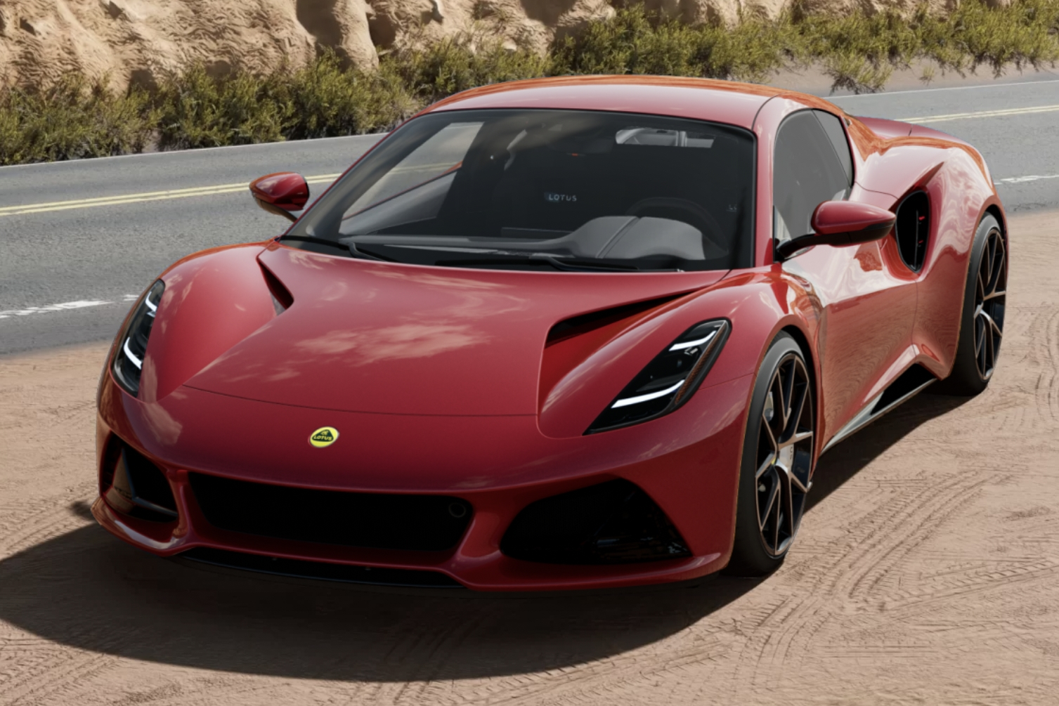
New Config Live!
- Thread starter Tonyshepp
- Start date
From what I gather, Storm Titanium has more brown undertones where Nimbus is lighter with a hint of bronze undertone... Is this correct? The sample disc we saw at the US roadshow just looked silver to me. I just don't want a dirty silver or sparkly beige car.You can see a bit of the nearby colours reflected in each one. On the Nimbus sample, the effect on the lower part of the right hand edge and clockwise round to the rear shaded section looks correct. The top half of that rear right corner has got a reflection in it which is making it darker. I do think you're going to see some big variations in colour and tone as the surface angle and lighting changes, like you see on the old Storm Titanium.
Is Lotus still planning to release actual photos of the painted cars?
It's funny, when you look at a car in real life your brain processes out a lot of the reflections of the surroundings, as you are there and have the context. But when you see a picture those reflections appear much more obvious. It's why taking good photos of cars is so difficult.Thanks for the clarification! Now I will only need to always park next to a dark verdant Emira when mine finally arrives!
This was my attempt to get the Magma Red sample on a Fire Red car. Although it looked great while standing there, it's largely useless due to all the reflections.
Yes, Nimbus is more bronze than brown and has a hint of cream too.From what I gather, Storm Titanium has more brown undertones where Nimbus is lighter with a hint of bronze undertone... Is this correct? The sample disc we saw at the US roadshow just looked silver to me. I just don't want a dirty silver or sparkly beige car.
Is Lotus still planning to release actual photos of the painted cars?
I believe pictures of actual cars will now come out around the same time as the press reviews in 2-3 months time.
If anyone is doing Dark Verdant, it looks like the configurator has been updated since yesterday to fix the colour in the Video mode. It was looking too light and now is a better match for the samples and Daylight/Sunlight modes.
If anyone downloaded the video yesterday, you should be able to do a side by side comparison - would be interesting to see.
Thanks to EmiraSi on TLF for spotting it
If anyone downloaded the video yesterday, you should be able to do a side by side comparison - would be interesting to see.
Thanks to EmiraSi on TLF for spotting it
Oh boy. A direct and specific reason to go back into the configurator…If anyone is doing Dark Verdant, it looks like the configurator has been updated since yesterday to fix the colour in the Video mode. It was looking too light and now is a better match for the samples and Daylight/Sunlight modes.
If anyone downloaded the video yesterday, you should be able to do a side by side comparison - would be interesting to see.
Thanks to EmiraSi on TLF for spotting it
Oh boy.
I liked the olive though. Dang it. Hahaha
So I did it. I went in and looked again. Now I’m withdrawing my deposit.To be honest, given how much everyone here uses the configurator I'm surprised no one else had spotted it first!
But then you probably all downloaded it to play on a loop
Kidding. Still lovely.
*Until later when I go back to Nimbus.
So I did it. I went in and looked again. Now I’m withdrawing my deposit.
Kidding. Still lovely.DV it is*.
*Until later when I go back to Nimbus.
@TXEMIRA, it’s a gorgeous colour. I hadn’t really appreciated it until watching the video just now. Nice choice!
How is Seneca so different between daylight and sunlight? I can't stand the light cotton candy blue that's shown here in the sunlight config, but it looks great in the daylight config. How do these compare to in person?? (I only got to see shadow grey in person here in the states)


Carbuzz are impressed:

 carbuzz.com

Lotus Emira's Ultra-Realistic Configurator Is Like A Video Game
You can now spec your ideal British mid-engined sports car.
Did not get the chance to see any cars or samples, but from what I read and saw online, Seneca has some light gold metal flakes in it and my guess is that it's what they are trying to mimic in the sunlight renderHow is Seneca so different between daylight and sunlight? I can't stand the light cotton candy blue that's shown here in the sunlight config, but it looks great in the daylight config. How do these compare to in person?? (I only got to see shadow grey in person here in the states)
View attachment 2664
View attachment 2665
I'd say the lighter is more representative. Its not baby blue though.How is Seneca so different between daylight and sunlight? I can't stand the light cotton candy blue that's shown here in the sunlight config, but it looks great in the daylight config. How do these compare to in person?? (I only got to see shadow grey in person here in the states)
View attachment 2664
View attachment 2665
Billyidoliser
Emira Fan
How is Seneca so different between daylight and sunlight? I can't stand the light cotton candy blue that's shown here in the sunlight config, but it looks great in the daylight config. How do these compare to in person?? (I only got to see shadow grey in person here in the states)
View attachment 2664
View attachment 2665
I agree this looks amazing. However, it's nothing like the sunlight render pic I posted. The sample roadshow disc didn't appear too baby blue in person either.View attachment 2667Quite representative I think! Have now seen the car in the flesh twice now and think it's amazing and really shows off the cars beautiful lines and design features, my choice!
The flake in Seneca is a very fine silver. The flake is only visible if you're very close to it, within touching distance. From further away it appears like a more uniform colour, almost solid.Did not get the chance to see any cars or samples, but from what I read and saw online, Seneca has some light gold metal flakes in it and my guess is that it's what they are trying to mimic in the sunlight render
You can see it in the portion of bodywork nearer the camera here, and not in the further away part:
...and in the sample in bright sunlight:
It's great fun playing with the config for sure!
But whats irritating (borderline mind boggling) is how Lotus still chooses to show the car "slammed" like the blue mule making its rounds. All colors, all pics, videos etc. Nothing like the grey car in all the test rides which sits higher with a larger wheel gap which supposedly reps the real car
But whats irritating (borderline mind boggling) is how Lotus still chooses to show the car "slammed" like the blue mule making its rounds. All colors, all pics, videos etc. Nothing like the grey car in all the test rides which sits higher with a larger wheel gap which supposedly reps the real car
BUT which grinds your gears more?It's great fun playing with the config for sure!
But whats irritating (borderline mind boggling) is how Lotus still chooses to show the car "slammed" like the blue mule making its rounds. All colors, all pics, videos etc. Nothing like the grey car in all the test rides which sits higher with a larger wheel gap which supposedly reps the real car
1. 20mm lower?
OR
2. TDC marker on Manual?
I'm the opp-- i want the black roof/mirrors AND silver exhaust tips (too beautiful to hide with all the accents etc)Am-I the only who's anoyed the lower black pack does not include black tail pipes and rear badging?
Love the new configurator though, will surely help my decision.
Similar threads
- Replies
- 0
- Views
- 1K
- Replies
- 36
- Views
- 2K
- Replies
- 34
- Views
- 5K


