In flesh it just looked a silver to me, nothing like the configurator. My photo in sunlight with pics of white and grey card for anyone who wants to white balance.Bizarrely, that looks nothing like the sample I saw at Parks - I know photos can never be trusted but the silver was not that dark nor warm in tone like that either.
Like you, colours are my business - i have been in the sign industry for 40 years, mixing colour matches by eye from Ral, BS and PMS references for signwriting and painting. I also paint in acrylics on large canvases with painstaking colour matching a key part of my work
We can't both be right so something weird is going on!
Navigation
Install the app
How to install the app on iOS
Follow along with the video below to see how to install our site as a web app on your home screen.
Note: This feature may not be available in some browsers.
More options
Style variation
-
📸 We've added a new feature to the site, the Showcase! You can check it out at this link: EmiraForum.com Showcase
🖼️ You can read a bit more at the announcement thread as well: Showcase -- an upgraded Journal
You are using an out of date browser. It may not display this or other websites correctly.
You should upgrade or use an alternative browser.
You should upgrade or use an alternative browser.
latest colour info...
- Thread starter eclat2emira
- Start date
The all black are my choice at the moment but only because I’d like to see the Nimbus along with the diamond cut in person to see if the “silvers clash”. Isn’t this
That's quite worrying tbh, wonder if there's been a changeBizarrely, that looks nothing like the sample I saw at Parks - I know photos can never be trusted but the silver was not that dark nor warm in tone like that either.
Like you, colours are my business - i have been in the sign industry for 40 years, mixing colour matches by eye from Ral, BS and PMS references for signwriting and painting. I also paint in acrylics on large canvases with painstaking colour matching a key part of my work
We can't both be right so something weird is going on!
The concave side doesn't work at allIn flesh it just looked a silver to me, nothing like the configurator. My photo in sunlight with pics of white and grey card for anyone who wants to white balance.
View attachment 908
In flesh it just looked a silver to me, nothing like the configurator. My photo in sunlight with pics of white and grey card for anyone who wants to white balance.
View attachment 908
With this gray it feels like a hopeless exercise - the tone is so nuanced. First you have variations in lighting, showroom or outdoors. Even sunlight changes temperature depending on time of day and thats before you take into account secondary light reflecting off coloured surfaces. Then you have screen calibration - I used to run a calibrated screen but who does that unless you're in the graphics / print business? The neutral gray cards help though (thanks!). In the end its going to be hard to go for the Nimbus without seeing it on the car in the metal.
I saw the sample at B&C at night under showroom lighting and there was no warmth to it - just looked straight neutral silver - yet your photos clearly show its warmer than neutral. We need Pantone numbers
")
It's similarity to blade silver and this video have been the best help for me, I've then looked at 570s on autotrader in various lighting situations.With this gray it feels like a hopeless exercise - the tone is so nuanced. First you have variations in lighting, showroom or outdoors. Even sunlight changes temperature depending on time of day and thats before you take into account secondary light reflecting off coloured surfaces. Then you have screen calibration - I used to run a calibrated screen but who does that unless you're in the graphics / print business? The neutral gray cards help though (thanks!). In the end its going to be hard to go for the Nimbus without seeing it on the car in the metal.
I saw the sample at B&C at night under showroom lighting and there was no warmth to it - just looked straight neutral silver - yet your photos clearly show its warmer than neutral. We need Pantone numbers
Edit : tried hosting it and inserting it but it just doesn't seem to want to play the video
Attachments
Last edited:
eclat2emira
Emira Maniac
- Thread starter
- #106
Yep, neutrals are a b*gger for taking on other tones. Reflected colour or light from an external source can change them and, as they are neutral, they reflect what is around them - this can be a blessing and a curse!With this gray it feels like a hopeless exercise - the tone is so nuanced. First you have variations in lighting, showroom or outdoors. Even sunlight changes temperature depending on time of day and thats before you take into account secondary light reflecting off coloured surfaces. Then you have screen calibration - I used to run a calibrated screen but who does that unless you're in the graphics / print business? The neutral gray cards help though (thanks!). In the end its going to be hard to go for the Nimbus without seeing it on the car in the metal.
I saw the sample at B&C at night under showroom lighting and there was no warmth to it - just looked straight neutral silver - yet your photos clearly show its warmer than neutral. We need Pantone numbers
Location is worth taking into account. In Scotland with our proximity to the arctic circle (it often feels like we are in it!) our light has a cool tone, which affects the colour of everything you observe in daylight. The nearer the equator you get the more colours "warm up"
I discovered this was the reason that the fabulous aquas, teals and coral shades evident in Florida and similar locations lose their "pop" when i try to use them in Scotland.
Colour is simply not as "fixed" as you'd imagine, perception light and context all changing it. The only thing I can say with certainty regarding colour is that my hair looks grey in all lights!
Yep, neutrals are a b*gger for taking on other tones. Reflected colour or light from an external source can change them and, as they are neutral, they reflect what is around them - this can be a blessing and a curse!
Location is worth taking into account. In Scotland with our proximity to the arctic circle (it often feels like we are in it!) our light has a cool tone, which affects the colour of everything you observe in daylight. The nearer the equator you get the more colours "warm up"
I discovered this was the reason that the fabulous aquas, teals and coral shades evident in Florida and similar locations lose their "pop" when i try to use them in Scotland.
Colour is simply not as "fixed" as you'd imagine, perception light and context all changing it. The only thing I can say with certainty regarding colour is that my hair looks grey in all lights!
Shame about the hair looking grey, I have the same problem but when visiting Florida it looks less grey due to the number of white haired men
It's similarity to blade silver and this video have been the best help for me, I've then looked at 570s on autotrader in various lighting situations.
Edit : tried hosting it and inserting it but it just doesn't seem to want to play the video
well that grey looks quite tasty
It's similarity to blade silver and this video have been the best help for me, I've then looked at 570s on autotrader in various lighting situations.
Edit : tried hosting it and inserting it but it just doesn't seem to want to play the video
That is one fine looking set of wheels!
eclat2emira
Emira Maniac
- Thread starter
- #110
Ahhh, the snow birds!Shame about the hair looking grey, I have the same problem but when visiting Florida it looks less grey due to the number of white haired men
eclat2emira
Emira Maniac
- Thread starter
- #111
Ahhh, the snow birdsShame about the hair looking grey, I have the same problem but when visiting Florida it looks less grey due to the number of white haired men
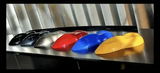
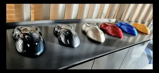
Someone posted new paint color samples on lotus talk. The samples are on small car shapes instead of disks. Not sure how to copy otherwise I would post.
Attachments
Mike-engel
Emira Fiend
Again, he red is still the most enigmatic. Sometimes it looks deep blood red and other times bright red and monochrome. I think I’m just going to go out and look at actual cars or we need to get our hands on the paint codes and spray them ourselves. What are the chances that the paint codes could be leaked?
This poor green isn’t getting any good light or pics. I bet this color moves up the charts as more folks get to see it on the car. So much potential.
This display is very helpfulAnd some close ups on one of the Facebook groups. They’re from the dealer roadshow at the Hethel factory today.
View attachment 978
View attachment 979
View attachment 980
View attachment 981
View attachment 982
View attachment 983
These are making it even tougher to choose. I like all of them.And some close ups on one of the Facebook groups. They’re from the dealer roadshow at the Hethel factory today.
View attachment 978
View attachment 979
View attachment 980
View attachment 981
View attachment 982
View attachment 983
freefall_junkie
Emira Fiend
All a matter of taste, but does anyone like shadow grey? It's just like every other grey tin box parked in your local supermarket car park and was a strange choice for the JB launch car. The red looks great those photos, brighter and less burgundy than the disc sample. The green is really growing on me too - wIth gold wheels it would look amazing. Still blue for me, but I reckon the Emira will look stunning in any of these colours, even shadow grey
Emira Forum Images


Emira Forum Images
Similar threads
- Replies
- 7
- Views
- 881
- Replies
- 1
- Views
- 1K